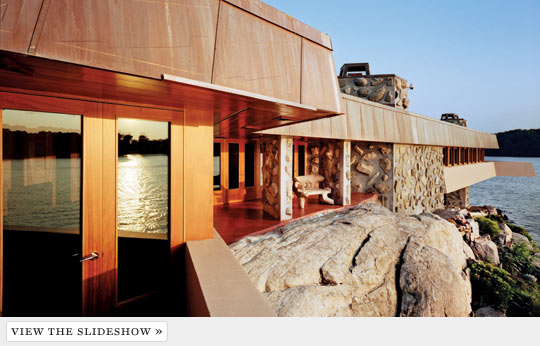
Friday, December 9, 2011

Post 10(3D)


Frank Lloyd Wright
I like the way he uses natural materials to provide a warm environment.

Gerrit Reitveld Schroeder, Schroeder House
This picture jumps out and shakes hands with my modernist ideals, the effective use of glass helps make the house look bigger.

Le Corbusier
Was this designed to withstand floods? This building may seem simple but it has so much more too it, look at the roof!

Walter Gropius
This picture looks very normal, white house with trees in the yard, but looking closer, you can see the designer's cues.

Philip Johnson
The building here looks like the three tiers of society to me, I wonder if the room costs are proportional. I love the way the building is built, as if I made it myself with LEGOS.

Ludwig Mies Van der Rohe


Marcel Breuer
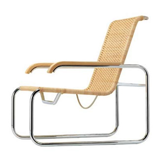
Contemporary furniture can be difficult to design, minimalistic approaches can result in furniture that doesn't look like much. However, Breuer nails it with this one, looking smooth and comfortable.

Saarinen
This use of materials is amazing, and the sheer size of it is overwhelming. The contrast brought by the tinted windows is intriguing.

IM Pei
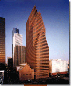
This building looks like a smashed soda can. As if you went to smash it with your shoe but missed and it popped out the side; disfigured, but existent nonetheless.

Robert Venturi
The use of columns was once significant of the roman empire; here, however, it represents a modernistic approach to the same design principles.

Frank Gehry
Looking like a building that somehow melted down in a massive fire, this piece of art and fantastic building brings you in for another look. 

Monday, November 14, 2011

Nov 11 post(drawing)


pentimento- an alteration in a painting, evidenced by traces of previous work, showing that the artist has changed his mind as to the composition during the process of painting

chiaroscuro- is "an Italian term which literally means 'light-dark'. In paintings the description refers to clear tonal contrasts which are often used to suggest the volume and modeling of the subjects depicted"

contour line- is a curve along which the function has a constant value

complementary color scheme- a color scheme that includes a main color and the two colors on each side of its complementary (opposite) color on the color wheel

analogous color scheme- a color scheme that includes a main color and the two colors one space away from it on each side of the color wheel

monochromatic- a monochromatic color scheme consists of different values (tints and shades) of one single color
iconography- the branch of art history which studies the identification, description, and the interpretation of the content of images
iconology- the study of icons in art or art history
foreshortening- is when an object appears compressed when seen from a particular viewpoint


crosshatching- is an artistic technique used to create tonal or shading effects by drawing (or painting or scribing) closely spaced parallel lines


modernism- in its broadest definition, is modern thought, character, or practice
post modernism- is a philosophical movement evolved in reaction to modernism, the tendency in contemporary culture to accept only objective truth and to be inherently suspicious towards a global cultural narrative or meta-narrative


picture plane- the imaginary flat surface which is usually located between the station point and the object being viewed


foreground- the part of a view that is nearest to the observer

middle Ground- the area in between the background and foreground

background- is the part of an image that lies outside the object(s) of interest captured by the image

This image captures all of the the three last vocab words.

Post 9(3d)

This picture of a klein bottle caught my eye when I was trying to figure out what it was. It seems interesting because of its irony. It would obviously be extremely difficult to use a klein bottle as a measurement tool, however there are clear markings on the side of the bottle implying its use.

Monday, October 31, 2011

Post 8(3D)

These are both the most interesting installation art models I have come across. The top picture just conveys a happy mood and discoish era so well it's incredible. The lower picture is a couple mini coopers stuck in the sand, they look to be full size and are probably fiberglass, but this type of art is very cool to look at, the ideas of these artists are genius.


Post 7(3D)

I used put together to create a unifying principle of color and concept. The work itself is very simple, but the way the light hits it creates a totally different thing altogether. The concept looks better and better the darker it is. Don't have photo, no camera.

Post 6(3D)

I was not there for this class, but I will critique physical connection as a unifying principal. Physical connection is important in many works of art, not only because of shape and light and texture, but also because it can convey actions, weight, strength, power, or even nothing at all.

Post 5(3D)

This is the sketch that popped into my mind. It reminds me that human heads are proportioned very interestingly. After all the talk about 2D and 3D concepts, I wanted to try to remember what the first design ever created looked like. Materials were used sparingly, but they created some incredibly intricate works of art and 3D design.