Monday, October 31, 2011

Post 8(3D)

These are both the most interesting installation art models I have come across. The top picture just conveys a happy mood and discoish era so well it's incredible. The lower picture is a couple mini coopers stuck in the sand, they look to be full size and are probably fiberglass, but this type of art is very cool to look at, the ideas of these artists are genius.


Post 7(3D)

I used put together to create a unifying principle of color and concept. The work itself is very simple, but the way the light hits it creates a totally different thing altogether. The concept looks better and better the darker it is. Don't have photo, no camera.

Post 6(3D)

I was not there for this class, but I will critique physical connection as a unifying principal. Physical connection is important in many works of art, not only because of shape and light and texture, but also because it can convey actions, weight, strength, power, or even nothing at all.

Post 5(3D)

This is the sketch that popped into my mind. It reminds me that human heads are proportioned very interestingly. After all the talk about 2D and 3D concepts, I wanted to try to remember what the first design ever created looked like. Materials were used sparingly, but they created some incredibly intricate works of art and 3D design.

Post 4(3D)

This type of compression is undefined, it is based on the artist's interpretation of space and lighting.
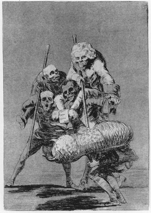
This compression is liquid, it is messy yet uniform, there are no gaps or bubbles, it looks evil.
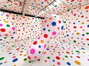
This is a very happy looking piece, the bright colors are intriguing, the compression is very tight, and the metal is still trying to keep it's shape.
This work of compression is not forced, but well planned and executed to accomodate everything that needed to be included.
This is my work, I bent the metal around a cylinder to create a spring effect. Compression envelops the whole sculpture.

Post 3(3D)

I used the lcd projector to shoot blue light through what I think looks like a tiki face. It has some sort of tropical look to it. The blue brings a nice glow to it, though using red could have created a menacing look. This type of thing has much potential, as light coming through objects can fascinate humans.

I used masks as iconographies. Still shots, not moving shots, blue light for color, and the space was dark and menacing.


Post 2(3D)

This is a cuboctahedron. I picked it because I like the color choice and the way that some sides are triangles and some are squares. This small variable makes a big difference in the way the shape presents itself to me. Many other types have all the same side, making this shape intriguing. 


Post 1(3D)

Design problem: washer and dryer are seperate machines
Solution: "Mount washer above dryer and have passage between for trouble-free washing and drying."©


Need: engineer, place to manufacture, investers
No similar designs.
Evolve into one full machine instead of two seperate machines bolted together

Oct 21 post(drawing)

The models are very interesting, I have never drawn anything like this at all, it is interesting, but also somewhat perturbing. I don't necessarily like drawing naked people, furthermore, I'm not particularly good at it...

Nov 4 post(drawing)

Hofmann is a very interesting guy, as a kid he was incredible at math and sciences and he went on to develop and patent such devices as the electromagnetic comptometer, a radar device for ships at sea, a sensitized light bulb, and a portable freezer unit for military use. Even having such talents, he decided that the creative studies are where he really wanted to spend most of his time. 


Oct 28 post(drawing)

The importance of space in drawing is amazing. When drawing the model, you must make sure that you can capture all of the edges and shadows and highlights. If not, your drawing looks flat, or even boring. I did not get the right shade on the chair so only the woman looks accurate in my depiction.

Oct 6 post(drawing)


A man must consider what a rich realm he abdicates when he becomes a conformist.
- Pubilius Syrus

It's easier to build strong children than to repair broken men.
- Frederick Douglass

Prejudices are what fools use for reason.
- Voltaire


Sep 30 post(drawing)

Hand drawing is very interesting, the human hand has many joints and complex shapes to it. One must start with the fundamental structure of the hand to end up with a proportional and normal looking hand. Ovals are best suited to fingers between the joints, fingers have three, thumb has two. Knuckles are difficult also, as they are different depending on the position of the hand and the person itself.

Sep 23 Post(drawing)

I wasn't here for this class, but I did the proportional drawing the class after. I decided to do a very detailed scale for proportional viewing. This helped me figure out how to make things that I am drawing disappear into space or the landscape. The scale figure was a rectangle that stretched until it was too small to draw.

Sept 16 post(drawing)


2. Goya uses light in the top person, every area that has been erased has a sort of glow to it. Furthermore, under the figures there is a vast amount of darkness, as if there is something hanging over or under them.

3+4. I made a landscape using the erasing method. First I darkened the whole paper with charcoal and then I figured out what I wanted to achieve. This let me focus on one thing, I came to the conclusion that a landscape could have several interesting effects with erasing. This worked quite well and contributed to one of my best works.

"This drawing started out as just a landscape. We were supposed to use erasing to created some type of drawing or picture. I decided to use the eraser first on the sun to create interesting lines on the inside. Then I had the idea to cut a hole in a piece of paper and erase through it. All of the "spikes" in this erasing were made from that mold of paper I made. The 2 bottom photos were edited by me photoshop."

Sept 9 Post(drawing)

I wanted to draw a figure in space that looked as if it could trick you, to hide a whole side of itself, something bipolar. I think I managed to convey some type of darkness or hidden motive in the figure itself.

Sep 2 Post(drawing)

Facial proportion is extremely important in a portrait, if the proportions are off, the whole drawing is off. My drawing was proportioned well because of my carefulness, but it somehow managed to look fake, as if the person wasn't coming to life off the paper.